Chapter 3: Typography
Many people confuse the words typography, typeface, and font, thinking that they are synonymous with each other, but they are not.
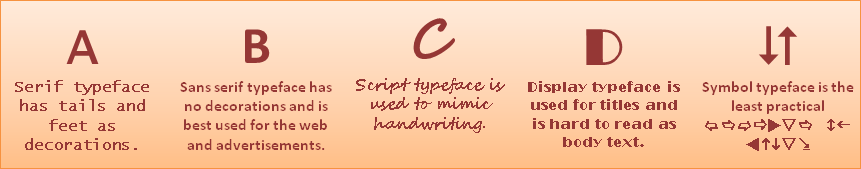
Typography is the art of using typefaces and fonts in designs to convey messages with styles befitting the designs. Typefaces are the five main categories or styles that all fonts fall under (serif, sans serif, script, display, and symbol). Fonts are the variations of typefaces that have been differently manipulated by designers throughout history.
To use an analogy, think of typography as motor vehicles. Then, think of typeface as the different kinds of vehicles: cars, trucks, vans, SUVs, and buses. Then, think of fonts as the makes of those kinds of vehicles; for example, a car can be a Toyota or a Ford, a truck can be a Dodge or a Mack, etcetera...
All typography serves to convey a message, the same way that all motor vehicles serve to get people from one place to another. The typeface serves to functionalize the message, much like a bus serves a different function from a car. And, the font serves to stylize the message, like the difference between showing up to an event in a limousine or in a 4-door family sedan.
Examples
Advertisement
In the online advertisement seen here, the designer has used a combination of color and contrast to attract the eye; there is also a good example of using three different typefaces. The script typeface used for the headline is what catches the eye and its message plays on a sense of nostalgia. Beneath that, the designer has used a serif typeface for an easier to read message which pulls at the heartstrings of the readers. Finally, at the bottom, the designer has used a sans serif typeface which is easier to read at a very small size, and has included a call-to-action by including the web address for readers to find more information.
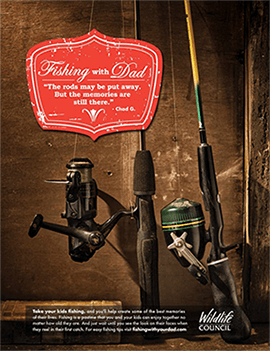
The target audience is anyone who likes fishing. The website includes all you need to know about fishing, but its main target audience is people in Colorado.
Poster
The wanted poster seen here is a good example of mixing too many contrasting fonts. A good rule of thumb is to use no more than three different fonts in any design, but the designer of this poster used six. The biggest problem with the typography used in the design of this poster lies in the words “THE MURDERER.” The font which is used is too conflicting with the other fonts, and its weight, width, and kerning leaves too big a gap between the two words on that line of the message – the resulting imbalance throws the whole design out of whack. That ill-designed piece of typography also takes away from the main message of the “$100,000 REWARD!”
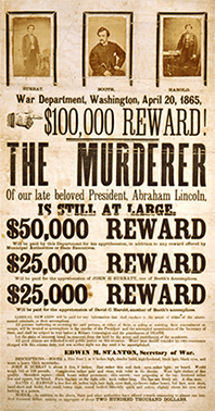
However, if we look at the overall design, and forget about the fonts, the hierarchy of the large type and the words “THE MURDERER” are definitely elements which catch a reader’s attention and draw them into the design. The target audience for a poster such as this would have been soldiers, or soldiers-of-fortune, so the design elements were probably not very important, other than getting the message across.
Web Page
The designer of this web page has used only three different fonts, keeping with the rule of thumb for typography in designs. The headline font is Hobo, a heavy, rounded, display font, which is very befitting of the subject because the style of the font matches the curvy, plump shapes of mushrooms. The sans serif font used in the navigation bar tabs at the top has an equal difference between the cap height (the tops of uppercase letters) and the x-height (the tops of lowercase letters), whereas the sans serif font used for the active links throughout the page have a higher x-height.
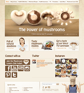
The target audience for this web page is probably health-conscious people who like to cook, and the colors and contrast of the typography make this web page easy for anyone to read and navigate.
Designing Infographics
The purpose of the infographic that will be designed for the sake of this eBook will be to share well-known and little-known interesting facts about the sturdy, but problematic, lovable breed of English Bulldogs. The target audience of the infographic is adults who are thinking about buying an English Bulldog as a pet and adults and children who already have an English Bulldog as a part of their family (many Bulldog owners collect various items that contain Bulldog images and information about the breed).
The headline of the infographic will be in a large, thick, serif font which is befitting the stockiness of the breed, and will catch a reader’s eye with the key message and draw them into the body of the infographic – keeping with the “5-second rule,” a hypothesis which Randy Krum (2014) has developed from studying five years of web analytics of his CoolInfographics.com website. According to Krum, the key message must be conveyed within 5-10 seconds because that is the average amount of time that readers spent viewing each of his infographic web pages while “skimming” his site (p. 284).
The sub-headlines of the infographic will be in a serif font with a kind of playful messiness (much like a Bulldog), which will help make the transition from the headline to the body text – an easy-to-read, sans serif font.
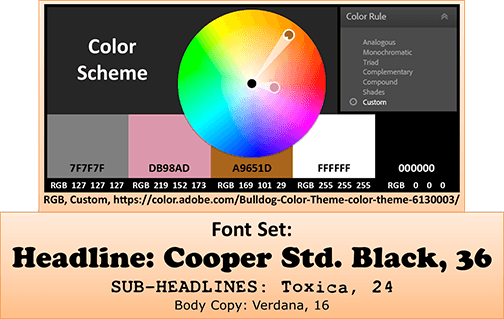
The infographic will contain images which pertain to each piece of information, including data visualizations, which will help to make the story flow. The color scheme (seen on the following page) was created using the common colors of the breed’s fur (the pink is included in the color scheme to represent the breed’s ever-present, ever-drooling tongue).
Style Guide for English Bulldogs Infographic: