Chapter 1: Project Planning
The Science of Infographics
Infographics have been used by humankind for thousands of years. The earliest infographics can be found on cave walls, and later examples are the ancient Egyptian and Mayan hieroglyphs, all of which use pictures to tell a story. Modern infographics can be seen as printed posters and signs, highway and road signs, and internet advertisements and online learning tools. As Randy Krum (2014) states, “People love using pictures to communicate and tell stories because it’s hardwired into the human brain” (p. 1). It seems that the more things change, the more they stay the same; no matter how advanced our technology becomes, we still communicate with pictures.
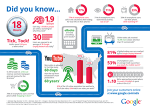
In this example (“Online Consumption Infographic” from Think with Google, 2011, found at https://www.thinkwithgoogle.com), the target audience is people and businesses who wish to advertise online; the goal of the infographic is to give readers pertinent facts and figures regarding the power of Google for connecting with consumers online; and the design choices which contribute to the effectiveness of the infographic are the introduction (“Did you know…”) which plays on the readers’ curiosity, the basic colors of red, blue, gray, and green on a white background, and a clear call-to-action at the end for the reader to visit the website.
Goal, Audience, and Design Choices of Infographics
The goal of infographics is to relate a story with the use of a combination of pictures, symbols, typography, and data visualizations (Krum, p. 6). “Data visualizations are the visual representations of numerical values” (Krum, p. 2), such as graphs and charts, but they are not infographics in and of themselves, they are merely a small part of the whole when it comes to the creation of infographics.
The audience for infographics is basically anyone who is seeking information. Whether someone is looking for the timeline of something, or differences between certain things, or the growth of a certain industry, there is probably an infographic in existence that will help to explain what a person needs to know.
Ultimately, a successful infographic is not just about its informative contents; its success also depends upon the design choices made by its creator. Questions to ask when putting together an infographic are:
- Who is the targeted audience?
- Is there a good balance of pictures, symbols, typography, and data visualizations?
- Are the colors in the design harmonious, or do they clash?
- Is the design of the story easy to read and understand?
- Does the infographic inform or persuade the reader?
- Is there a concise call-to-action at the end?
The ultimate goal of infographics is to keep the reader interested in the story until the very end, where they get the contact information that is intended to be conveyed.
History of Infographics
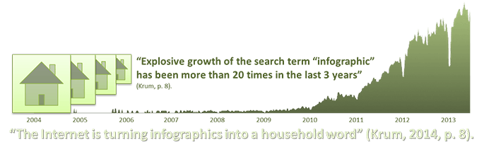
The Rise of the Informavore
According to Krum (2014), the term infographics was originally only used by print publications and art directors to describe any form of data visualization, but since the dawn of the Information Age, brought on by the exponential growth of Internet usage, the term has evolved into meaning a larger design that combines many design elements to tell a story, where data visualizations are just a part of the larger design.
In the present Information Age, we are constantly bombarded with what seems like an endless amount of visual stimuli – it is our job to weed out the useful bits and make sense of them. It is in our human nature to be hunter-gatherers, and the process of hunting and gathering information comes just as naturally to us as hunting and gathering sustenance in order to survive. Noted cognitive psychologist, George A. Miller, coined the term informavore in 1983 to describe the human tendency to hunt and gather information, and the Internet has boosted “the rise of the informavore” (p. 9).
The Rise of Big Data
The rise of the informavore gave rise to the Internet, which gave rise to big data, which gave rise to the informavore, and so on, and so on… The fact of the matter is that the exponential growth of each component of the cycle keeps feeding into the exponential growth of the other components.
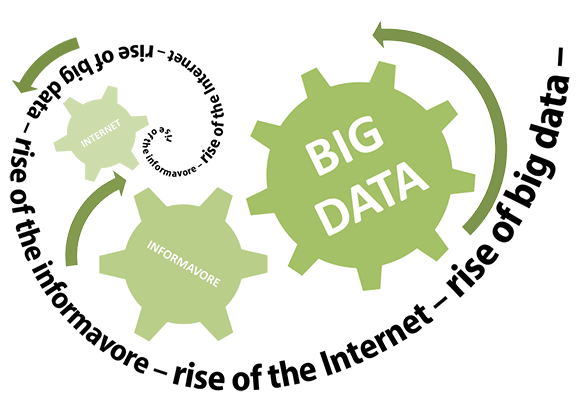
THE AMOUNT OF INFORMATION AVAILABLE ON THE INTERNET IS EXPECTED TO NEARLY DOUBLE EVERY YEAR
Why Infographics Work
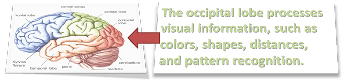
The reason why infographics are so effective is because of the way the human brain works. Studies show that more than half of the human brain is dedicated to processing visual stimuli, such as vision, shapes, colors, visual memory, movement, spatial awareness, distance, and pattern recognition.
Pattern recognition is the ability of humans to make sense of what they see in an instant and has been a fundamental human survival tool for thousands of years. Pattern recognition also helps to make an infographic effective. For instance, when we see a line in a data visualization going up or down, we know instantly that the subject matter is either growing in strength or depleting; whether the up or down trend is good or bad depends on the subject matter. If the subject matter in a graph is the average salary in the country, then an upward trend is good and a downward trend is bad. However, if the subject matter is crime, then an upward trend is definitely bad and a downward trend is something we all look forward to seeing.
Context
![NYC carbon dioxide emission [infographic] by M. Parkinson (2012).](images/info-6.png)
NYC carbon dioxide emission [infographic] by M. Parkinson (2012). Retrieved from http://graphs.net/infographics-on-new-york.html.
When creating infographics, context is king.
Context is the use of multiple values compared to each other to give each value more meaning. When a person reads a number without something to compare it to, the number makes no sense. Take this sentence for example: “New York City contributes .05 gigatons of carbon dioxide” (Parkinson, 2012). That’s a really big number (1 gigaton equals 1 billion tons), but the sentence doesn’t mean anything unless it’s put into context and compared to another figure.
By comparing the .05 gigatons of CO2 that New York City produced to the 30 gigatons that the entire world produced, we find out that New York City only contributed 1/600th of all of the globe’s carbon dioxide. So, by putting New York City’s contribution of CO2 into context with the world, the amount doesn’t sound so bad, but, if it was compared to a city like Key West, Florida, it would be terrible.
It is a constant struggle for designers to use numbers in context and still remain unbiased. The simple act of a designer choosing which values to include in an infographic, which will undoubtedly sway people’s thoughts, introduces bias to the design (Krum, 2014, pp. 16-19).
The Picture Superiority Effect
When people read information in text form only, on average, they can only remember about 10 percent of the information 3 days later. That would be like only remembering the letter ‘C’ from communique. That communique without a visual aid would not leave much of an impression. However, when text is accompanied with a related picture, the information retention jumps to about 65 percent 3 days later. This is what is known as “the Picture Superiority Effect” (Krum, 2014, pp. 20-22).
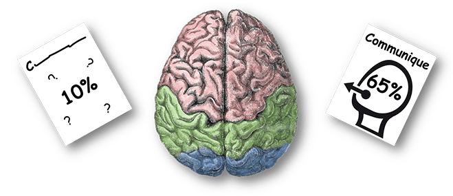
A study by McCabe & Castel (2008) showed that including an image of a brain actually makes people believe more of what they are reading, even if the information isn’t correct.
The Art of Storytelling

Every infographic should tell a story, and like any story, it should have an introduction or foundation, a main event or key message which gives meaning to the story, and a memorable conclusion or call to action.
As seen in the sequence of clips above from the 1923 silent film, The Hunchback of Notre Dame, the opening introduces us to Quasimodo, who is a happy and pitiable soul who loves to listen to the church bells. When Quasimodo is whipped in the town square, the beautiful gypsy, Esmeralda, shows him pity and he falls in love with her (this is the main event of the story). In the end, Quasimodo is devastated because Esmeralda is in love with someone else, and Quasimodo dies of a broken heart.
Single Image Storytelling
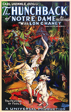
In the movie poster seen here, the story is attempted to be told with a single image. The picture is derived from the opening scene of the movie, in which the entire town is celebrating the “Festival of Fools.” The main focus of the image is the gypsy queen, Esmeralda, whom all the main male characters, including the hideous Quasimodo, have their eyes on. The designer of this picture undoubtedly chose Esmeralda as the main focus because it is she who causes the most conflict in the story.
The designer has also included all of the most important information about the movie in the design, such as the title, the writer, the star and director of the movie, and the production company that made the film.
Using designs to tell a story helps the readers retain more of the information that is being conveyed. Storytelling also helps readers to process the complex data included in most infographics. When there is a story to relate the data to, the information becomes more memorable.