Chapter 7: Usability
Usability relates to how well designs function regarding ease of access and ease of use. Things to consider for ease of use are using an F-pattern layout, descriptive headlines, clear visual hierarchy (with the use of colors and high-contrast), well-organized content, and accessibility for the physically impaired.
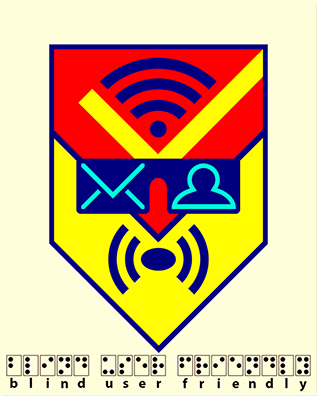
Considerations must be taken for those who cannot see very well and those who cannot see at all. The visually impaired use special screen-reading software to navigate the web, but since most images are seen by screen-reading software as blank boxes, a short description of the information in an infographic should be written into the HTML code (Krum, 2014, pp. 136-143). And, according to Leslie Duncan (2013), “it may be best to create a separate, plain text version” of any web page that contains images.
Infographic Resume
According to Krum (2014), infographic resumes are growing in popularity. Originally, infographic resumes were only used by those in creative fields such as graphic design, but, since they are a proven way to get noticed by potential employers, their use is becoming more mainstream. However, it is a good idea to only use an infographic resume to supplement a standard typed resume. This is because many businesses use “automated job application systems (also called application tracking systems)” (p. 204), which sort text-only resumes, pulling out keywords so that potential hirers can easily find matches in the databases for their open positions.
One way to kill two birds with one stone, however, is to create what Krum refers to as a “combined infographic resume design” (p. 204). A combined design puts graphic designs together with readable text; that way, when the resume is uploaded into automated readers, the systems simply ignore the graphics, but still have all of the written information to parse. The only down side of combined infographic resumes, as Krum explains, is the fact that less information ends up written in the resume because of the space taken up by the graphics. When creating a combined infographic resume, an applicant needs to not only be creative with their graphics, they also need to be creative in their writing skills, making sure to include the most important information in as few words as possible.
It is also a good idea to keep an infographic resume the size of one page (8.5”x11”) so that it can be easily printed and shared – no long, scrolling vertical infographics when it comes to resumes, unless you have your own dedicated web page for your design.
Examples
Timeline Resume
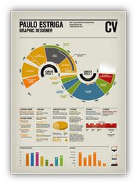
In the resume above, Estriga has divided his timeline into two “career cycles” – his time in Lisbon, Portugal, and his time in London, England. This eye-catching design also includes his personal skills.
Skill Emphasis Resume
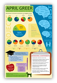
In the skill emphasis resume above, Greer does a good job of using the “Picture Superiority Effect” (see p. 10). Her use of bright colors is eye-catching and the images of brains make her information more believable.
Separate Text Resume
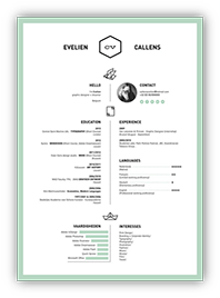
In this separate text resume, Callens keeps her graphics to a minimum and uses a soft color to please the eye. This type of infographic resume stands out, but is easy for automated systems to read.
Reference Image
As a reference to use for my own infographic resume, I chose the combined infographic resume design by Vanessa Wilson (2011). I like the fact that the timeline has overlapping aspects in the applicant’s life, as this is often the case with many creative people. The color codes also define the different types of lifetime achievements.
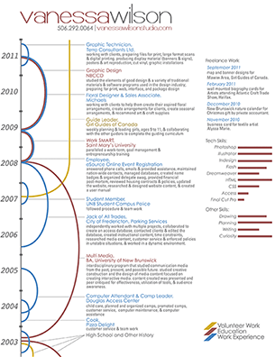
I also like the fact that this type of resume can be uploaded to an automated system. Because the entire infographic resume can be created using Microsoft Word™, the text can be read by any application tracking system. And, because there are full-text descriptions as well as data visualizations, there is no need to worry about what can and what cannot be seen by a computer.
My infographic resume will not be an exact copy of Wilson’s layout; I merely got my inspiration from her design.
Custom Infographic Resume
In my combined infographic resume, I used a little whimsy in my personal description (“Creative Genius”), hoping to catch the attention of prospective hirers, and I have included a photo of myself and all of my contact information, including a link to an online portfolio on Facebook™.
On the left, I incorporated the idea of the timeline with overlapping lifetime achievements. I included a small graphic of a man slipping and falling to represent the reason why I no longer work as a carpenter (more whimsy). And, I included the year of my birth to show my age.
I have also included the logos of the social networking sites that I use, which I placed according to the aspects of my life in which I use them.
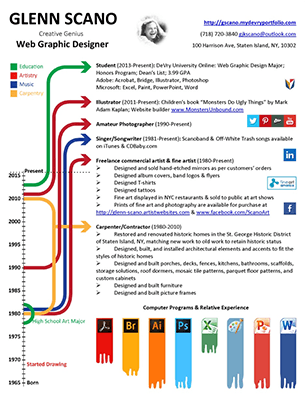
At the bottom, I have included a data visualization of the different computer programs that I am familiar with and my relative proficiency levels in using them.
Note: I have updated my infographic resume several times since the publication of the original PowerPoint presentation from which this website is derived, and my resume will continue to be changed and tweaked as time goes on.